info@propaganda-group.be
+32 2 725 29 10
BE 0453 854 981
+32 2 725 29 10
BE 0453 854 981
Zaventem
Minervastraat 4
1930 Zaventem
1930 Zaventem
Leuven
K. Begaultlaan 1a/4
3012 Leuven
3012 Leuven
Gent
Kuiperskaai 6
9000 Gent
9000 Gent
Numbers. Data experts and strategists love them. Marcom professionals and their creative colleagues? A bit less. But there is one thing they can certainly agree on: convincing people with raw data on a screen or in an Excel sheet is no walk in the park. So, how do you translate plain numbers to a story that gets your stakeholders on board? By allowing the mathematician and the storyteller inside of you to cooperate.
No matter how much we at Propaganda Group believe in the power of data, we see every day that numbers alone aren’t enough to convince colleagues and customers. However, as content marketers we know that a good story can make a difference. Combining data with storytelling creates stronger persuasion—no matter the situation or role. Els Mortier, Head of Strategy of Propaganda Group, borrows insights from the book Storytelling with Data by Cole Nussbaumer Knaflic when explaining how you can translate numbers to compelling stories in just four steps.
Presenting data is communicating and just like with any form of communication, it’s important to first consider the audience you want to reach. Before diving into the numbers, ask yourself the following questions:
Taking the time to consider these questions beforehand ensures that you present a relevant and clear data-driven story. It may be tempting to skip this step, but the time you invest in preparation will more than pay off by making your decision-making process faster.
A bar chart, a line graph, or maybe just a table? Charts come in all shapes and colors. But no matter how eye-catching it looks, that multicolored, spinning 3D design isn’t suitable for every presentation. Charts should support your data—not the other way around.
The choice of visualization determines how quickly and effectively your audience will understand your message. A few simple guidelines can help you make the right choice. The key is to consider the specific data you want to present.
Avoid pie charts, donut charts, and 3D graphs. They are hard to read and often prove to be misleading. Simplicity and clarity are the key factors when choosing a chart.
With good data visualization, you can guide your audience in a specific direction. This is important because if you, as a speaker, don’t capture your audience's attention, they will start drawing their own conclusions, with all the risks that come with it. Effective data visualization doesn’t stop at choosing the right chart type. Using the visualization strategically determines how impactful your message will be.
You can steer your audience’s focus by applying a few simple tricks.
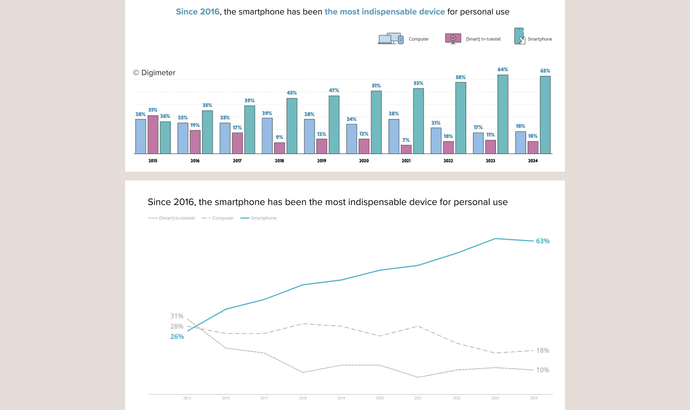
A graph only works if your audience sees what you want them to see. Take, for example, these two visualizations. Both illustrate the rise in smartphone usage since 2015. While readers have to navigate through a prominent legend and a cluttered bar chart in the first graph, the second graph immediately conveys the core of the story.
A well-chosen graph provides clarity, and a clear structure guides your audience through the numbers, but in the end, it’s the story that ensures the message sticks with your audience.
Like any story, a data presentation has a beginning, middle, and end. These three key questions can help you build your story:
Presenting data goes beyond charts and report. It’s the art of translating numbers into actionable insights. The next time you’re present data, ask yourself whether you’re telling a compelling story or whether you’re just showing plain and forgettable numbers.